WordPress Image Cropping and Ratios
If you have ever uploaded what looked like a perfect image into WordPress only to discover that parts of it were cut off, stretched, or awkwardly cropped, you are not alone.
This is one of the most common frustrations WordPress users run into, especially when working with featured images, WooCommerce products, sliders, banners, and blog thumbnails.
For a long time, I assumed the issue was simply “bad image handling” by themes or plugins. But after digging deeper into how WordPress processes images, I realized the real issue was not WordPress itself. The problem was understanding how image ratios and display containers work together.
Once you understand that relationship, designing images becomes much easier and your website instantly starts looking more professional and consistent.
What Happens When You Upload an Image to WordPress?
When an image is uploaded into WordPress, the system usually creates multiple versions of that image automatically.
For example:
-
Original image
-
Thumbnail size
-
Medium size
-
Large size
-
Theme-specific sizes
-
Plugin-specific sizes
A single upload may generate several physical image files behind the scenes.
Example:
photo.jpg
photo-150x150.jpg
photo-300x200.jpg
photo-1024x683.jpg
These additional images are used so WordPress can load properly sized images depending on where they appear on the site.
This improves performance and responsiveness, but it also introduces the possibility of cropping issues.
Why WordPress Crops Images
WordPress itself is not randomly cutting images.
The cropping usually happens because a theme or plugin needs images to fit a specific layout shape.
For example:
-
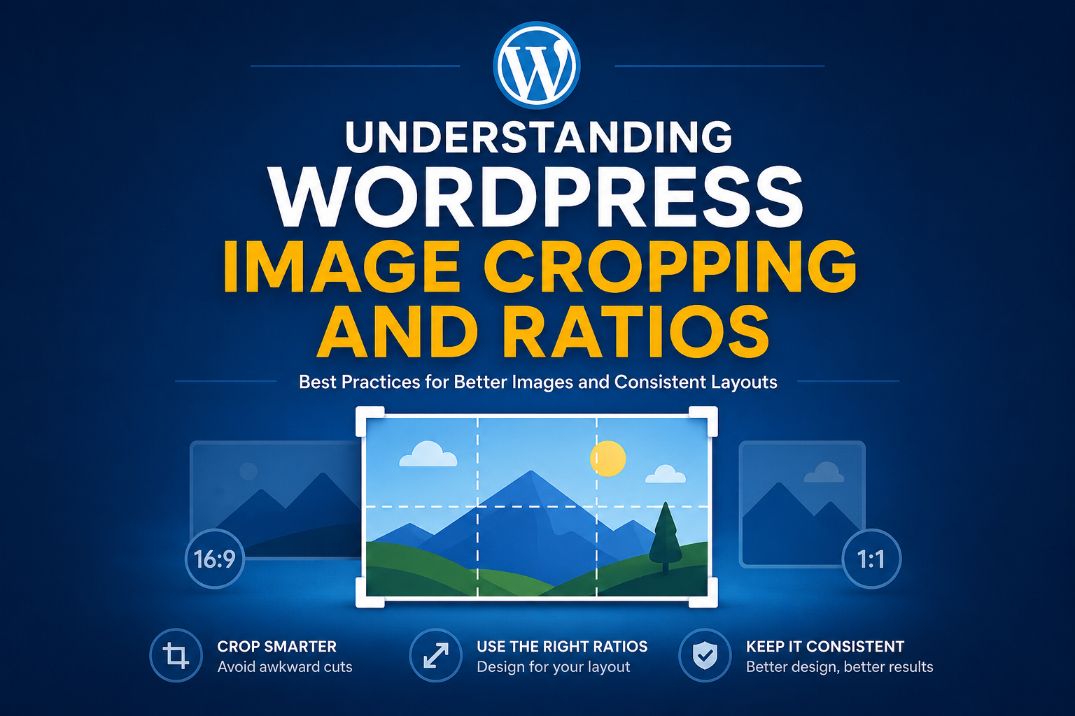
A blog card may require 16:9 images
-
A product grid may require square images
-
A slider may require a wide banner format
-
A sidebar widget may need portrait dimensions
If your uploaded image does not match the expected ratio, WordPress or the theme must decide what to do with it.
Usually there are two approaches:
1. Proportional Resize
The image shrinks while maintaining the full image content.
Nothing gets cut off.
2. Hard Crop
The image is cropped to force exact dimensions.
This is where portions of the image disappear.
The Real Problem Is Usually Not Cropping
The real issue is often this:
We design images first and think about the display container later.
That is backwards.
The better workflow is:
-
Determine the container ratio
-
Design specifically for that ratio
-
Keep important content within safe areas
This changes everything.
Designing for the Container
This was the biggest lesson I learned.
Instead of creating random image sizes and hoping WordPress handles them correctly, it is much better to intentionally design images for their exact display location.
For example:
Blog Featured Images
Recommended ratio:
16:9
Example size:
1200×675
Product Images
Recommended ratio:
1:1
Example size:
1200×1200
Hero Banners
Recommended ratio:
21:9
Example size:
1920×820
Slim Header Sliders
Recommended ratio:
Very wide strip format
Example:
1200×90
This type of banner is extremely common on modern websites. It works well for:
-
announcements
-
rotating promos
-
branding
-
lightweight motion graphics
-
menu-integrated sliders
The key is understanding that the content inside the banner must match the available space.
A short banner works great for:
-
logos
-
short text
-
simple visuals
-
calls to action
But it is not ideal for complex scenes or detailed imagery.
That does not make the format bad. It simply means the design should fit the purpose of the container.
Understanding Safe Zones
One of the best practices for WordPress images is leaving safe space around important content.
Avoid placing:
-
text
-
logos
-
faces
-
product edges
too close to the borders of the image.
Why?
Because themes, responsive layouts, mobile devices, and sliders may crop differently across screen sizes.
Keeping important content centered dramatically reduces visual problems.
Why Consistency Matters
One of the biggest reasons websites look visually inconsistent is random image dimensions.
When every image has a different ratio:
-
cards become uneven
-
grids break visually
-
sliders behave unpredictably
-
mobile layouts become messy
Using intentional ratios creates consistency across the entire website.
This is one of those small details that separates amateur-looking websites from polished ones.
Final Thoughts
The biggest shift for me was realizing that image design should begin with the display container, not the image itself.
Once you know the exact ratio your theme or plugin requires, image creation becomes intentional instead of experimental.
WordPress image cropping stops feeling random because you finally understand the purpose behind it.
Instead of fighting WordPress, you start designing alongside it.
And honestly, that one mindset shift can improve the visual quality of an entire website.